Box and Whisker Diagrams
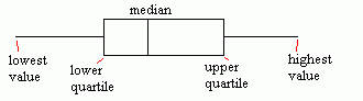
Given some data, we can draw a box and whisker diagram (or box plot) to show the spread of the data. The diagram shows the quartiles of the data, using these as an indication of the spread.
The diagram is made up of a "box", which lies between the upper and lower quartiles. The median can also be indicated by dividing the box into two.
The "whiskers" are straight line extending from the ends of the box to the maximum and minimum values.
Image
Outliers
When collecting data, often a result is collected which seems "wrong". In other words, it is much higher or much lower than all of the other values. Such points are known as "outliers". On a box and whisker diagram, outliers should be excluded from the whisker portion of the diagram. Instead, plot them individually, labelling them as outliers.
Skewness
If the whisker to the right of the box is longer than the one to the left, there is more extreme values towards the positive end and so the distribution is positively skewed.
Similarly, if the whisker to the left is longer, the distribution is negatively skewed.
Category